Project Description
WeAudit Taiga is a public-facing platform designed to analyze generative AI systems and highlight potential biases. As a team of six, we reimagined key aspects of the site’s bias reporting system by redesigning both the user flow and interface.
Research Prompt We Identified
Our guiding question was: What would motivate everyday users—particularly those outside of minority groups or not directly impacted by AI biases—to engage more deeply and spend time learning about the consequences of bias in generative AI?
01. Identifying the Problem Space
We conducted usability testing with different participant groupings to surface pain points and synthesize recurring issues. Our methods included Think-Aloud Usability Testing (15+ participants), Affinity Diagramming, and User Findings Templates.
Key FindingsSimplified UI
A streamlined interface helps users focus on essential features and makes their actions clearer.
Lack of Instructions
Users often struggled to understand the site’s purpose and functionality. A clear instruction page or onboarding experience is necessary to guide them through the platform.
Inconsistency
Discrepancies between the instruction page and the actual tasks created confusion, highlighting the need for alignment between guidance and functionality.
02. Questions, Ideas, and User Needs
From there, we generated a set of inquiries that would help guide our future interviews and assumptions.

What can we do when the user themselves have biased point-of-views?How to identify perpetuated biases passed in from biased data?
We already held many assumptions of gen AI biases and AI auditing from the background research so we used reverse assumoption reframe to challenge our existing assumptions and uncover different ideas that we might have overlooked.
03. Reverse Assumptions Reframe
.jpg)
.jpg)
.jpg)
04. Empathy Map + Journey Map + Affinity Clustering
To further leverage the data we gathered, we explored it in another context, such as user empathy and emotion, to better understand their needs. Then, we prototyped different levels of user flow for our next stage of prototyping.


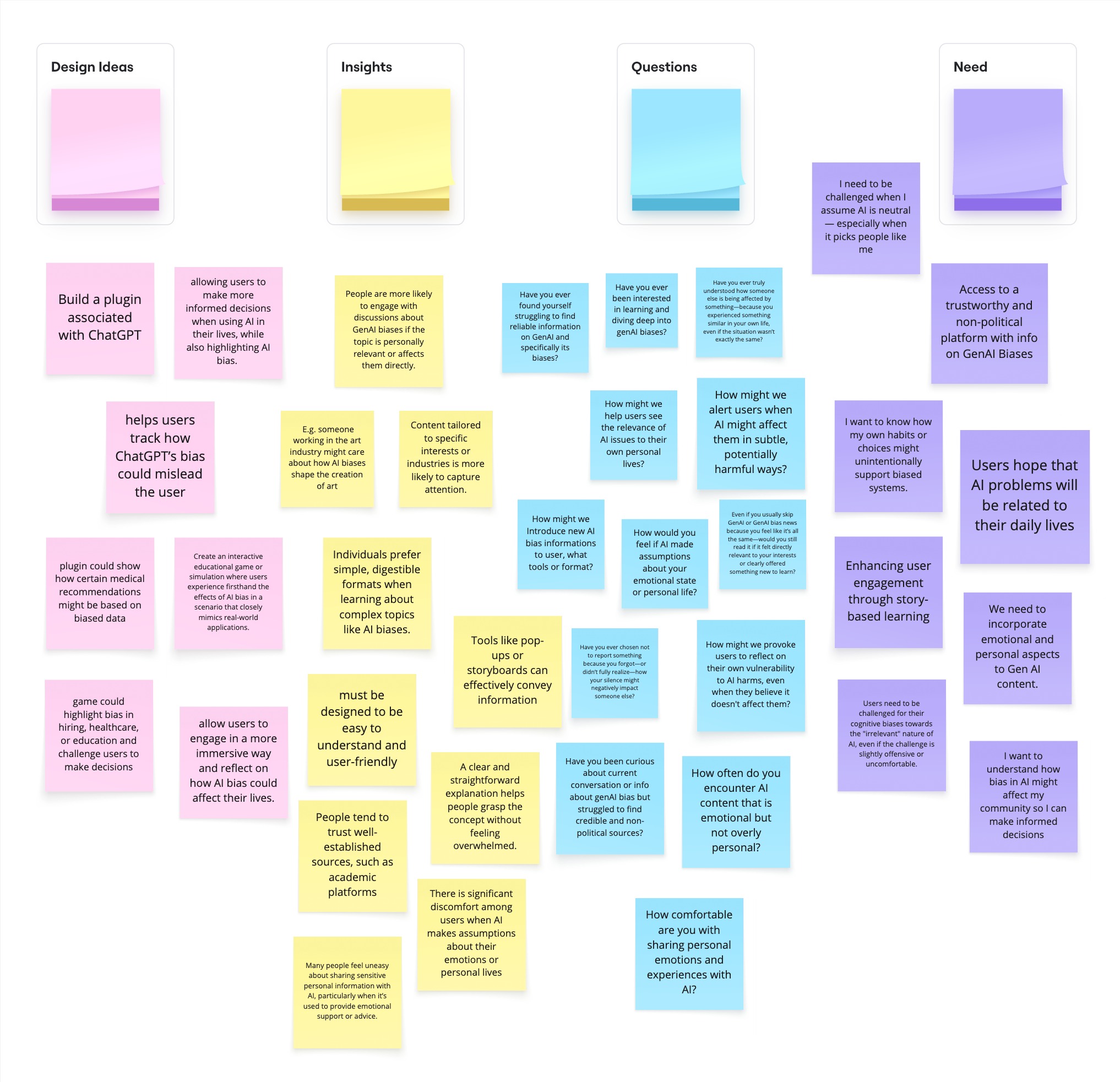
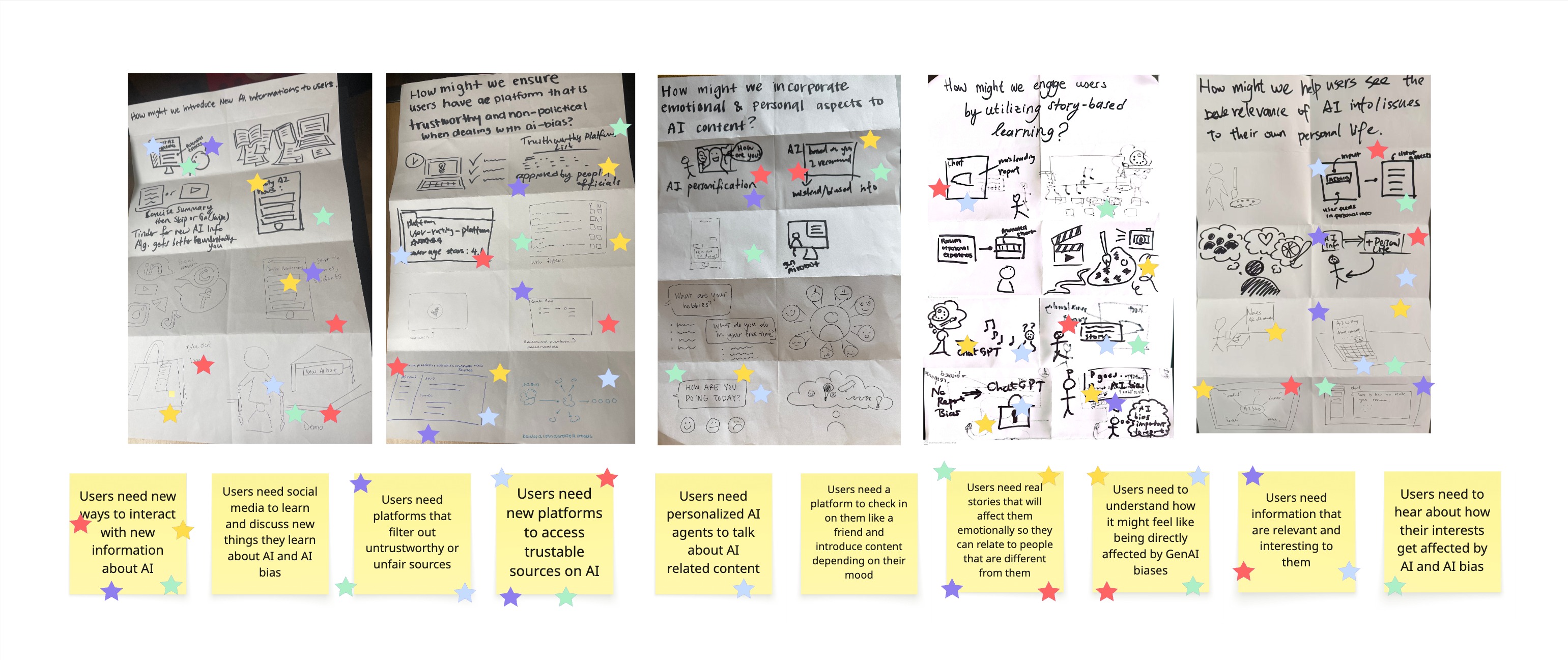
05. Walk the Wall + Crazy 8's Voting
Our team conducted a second wall walk to revisit the affinity diagram from our contextual interviews and extract deeper insights for design opportunities. During the session, sticky notes were organized into three categories—Design Ideas, Insights, Questions, and User Needs—with each member contributing notes in a designated color. This method helped us visually cluster insights, compare perspectives, and identify patterns that guided our next round of design decisions.
Final Product
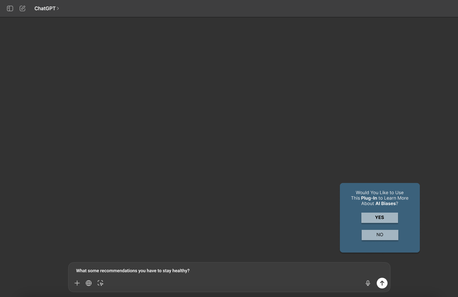
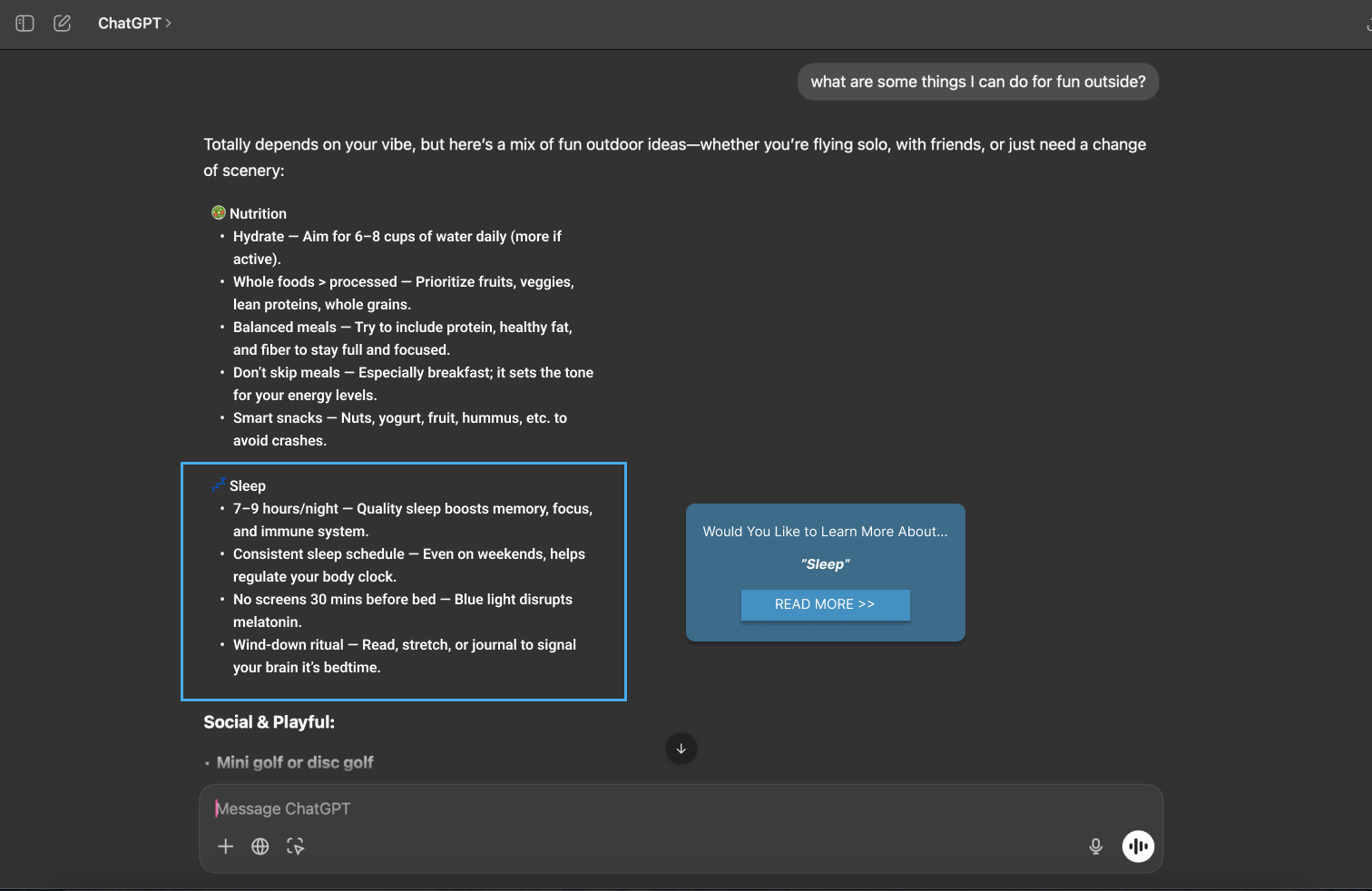
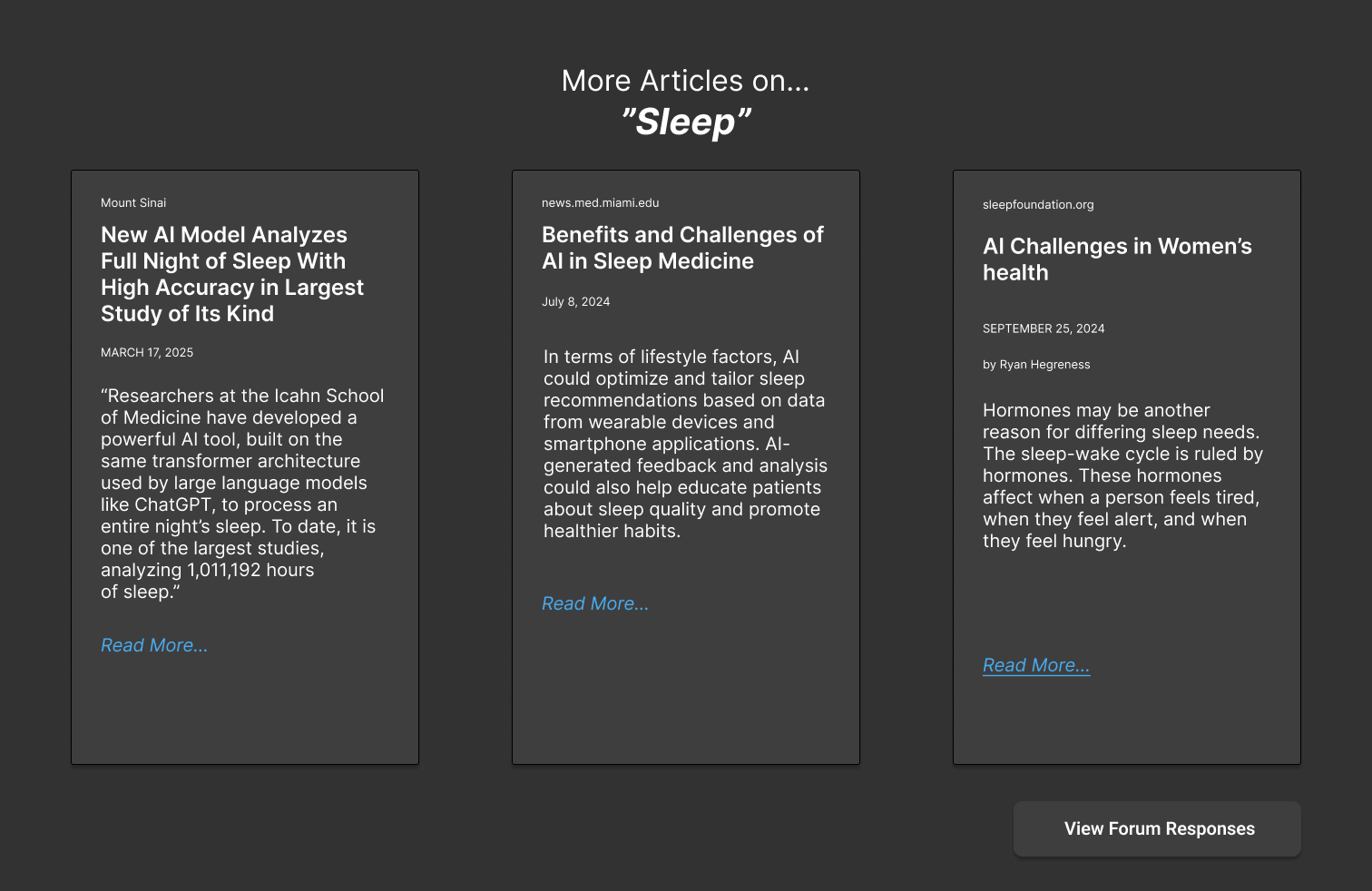
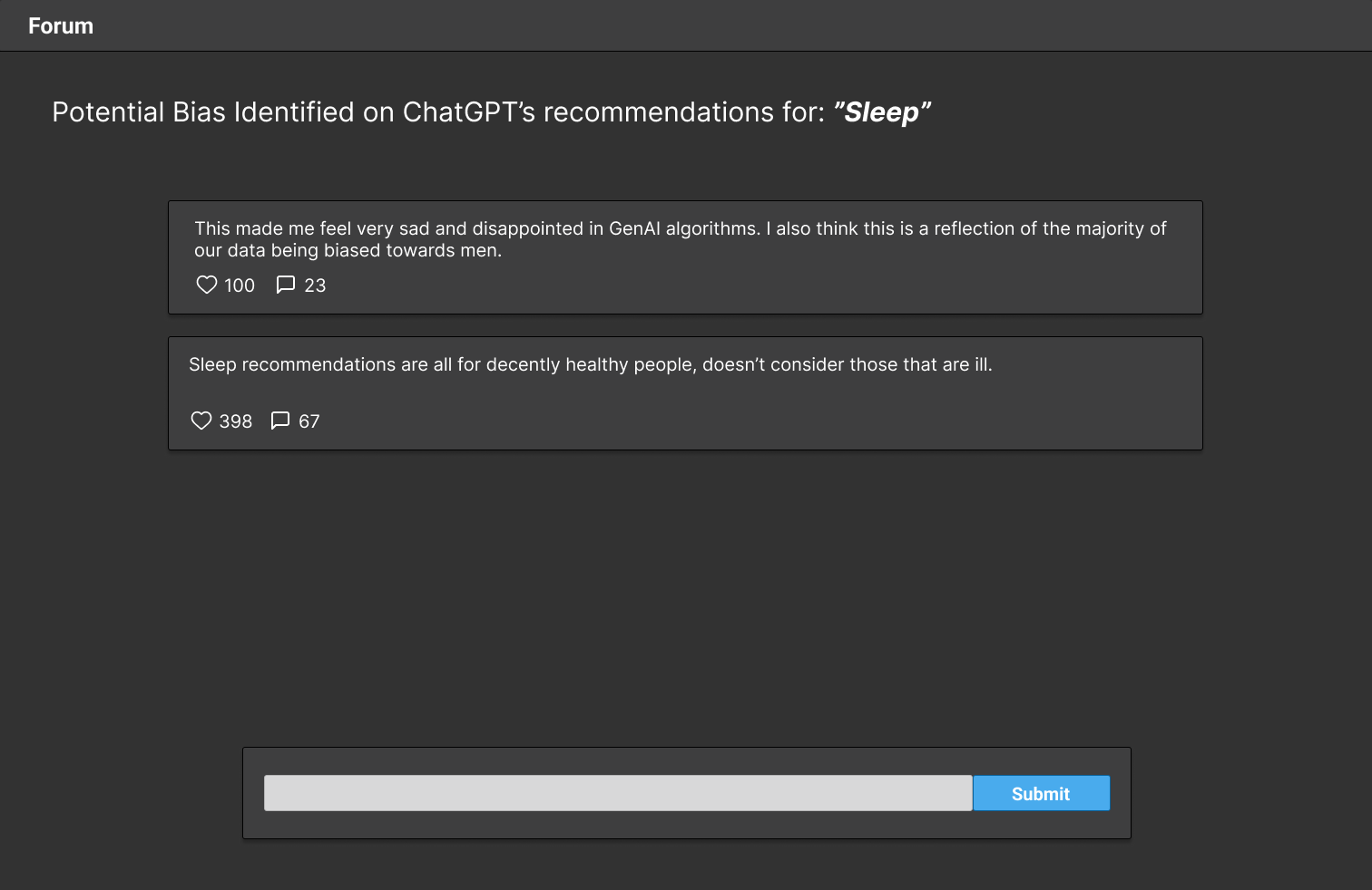
Our current solution will be mimicked to be in ChatGPT, as we found through research that this was the most commonly used GenAI platform between all of our users. It will act as an easy-to-add plugin to ChatGPT that will scan all of ChatGPT’s recommendations, prompt related articles on the recommendation,and have an option to check the related forum and add their own opinion. Our anticipated outcome is that the user will try out the forum and spend time looking into the articles.
Successes Quantitative Metrics:
● Google Form Duration (Assumed:most of the users spend +4 mins, Found: ~14 mins) -> High engagement with reflectivequestions.
● Prototype Use Duration (Assumed:most of the users spend 2-3 mins, Found: 4 mins) -> Meets the minimum successbenchmark (≥2–3 mins).
● Usefulness (Assumed: ≥ 4 out of 5 , Found: 4)->At success threshold. Tool is considered useful.
● Recommendation (Assumed: ≥ 4 out of 5 , Found: 4) ->Strong willingness to recommend, suggesting perceived value.
We had high engagement with the google form and prototype signifying capture of interest in the plugin tool. We were also able to validate that this solution was overall sufficient for our users with most considering the tool useful and were willing to recommend to other family members and friends.
Qualitative Metrics:
● 47% of users found the tool informative and educational, appreciating articles and forums that explained AI bias.
● 29% praised the clear layout and ease of navigation.
● Additional positives included seamless integration (12%), increased bias awareness (18%), and appealing visuals (18%).
● Most users (71%) noted no major issues or confusion, signaling general acceptance of the design.
● Positive word cloud resultsOur plugin tool was able to successfully educate and inform users about AI bias validating our research goal. Overall plugin tool for users felt intuitive with little to no learning curve and no major issues.
Failures Quantitative Metrics:
● Overall Interest (Found: 3/5) -> Below success threshold (4), suggests moderate interest.
● Consistent Use (Found: 3/5)-> Indicates hesitation in regular use.
Qualitative Metrics:
● 24% questioned the usefulness or relevance of the plugin, unsure how it added value beyond ChatGPT.
● 18% cited disruptive full-screen transitions and low engagement, especially from users not already interested in AIbias.
● Navigation confusion (18%) and unclear forum features reduced perceived value.
● Some users felt the experience was too passive or lecture-like, limiting interactive learning.
What We Learned:
Our prototype showed early success in presenting GenAI bias in a way that users found informative, visually clear, and easy to navigate. Many appreciated that the tool was optional and unobtrusively embedded within ChatGPT. However, we also learned that subtle design alone isnʼt enough to drive consistent engagement—some users found features unclear,disconnected, or lacked the motivation to explore further. This highlights a key insight: to truly increase motivation among everyday users, weʼll need to make the experience feel more personally relevant, emotionally engaging, and better integrated into their natural flow of conversation.