Design Hero: Wang Zhihong

Poster, Booklet & Motion
Project Overview
This project reinterprets Taiwan famous Graphic Designer Wang Zhihong's distinctive design philosophy across poster, booklet, motion, and digital formats. Known for his minimalist aesthetic, refined typography, and conceptual depth, Wang’s work balances restraint with bold intent—quietly challenging conventions through thoughtful visual language.

Each piece in this series draws from his commitment to structure, beauty, and meaning. From precise grids to poetic composition, the project celebrates design as a meditative process—one that transforms everyday visuals into intellectually rich and emotionally resonant experiences.
Duration:
12 Weeks Spring 2025


Role:
Design Systems
Identity Design
Print
Motion
Graphic Design
Interaction Design


Individual:
Adivised by Brett Yasko


Tools:
InDesign
Illustrator
Photoshop
After Effects
Figma

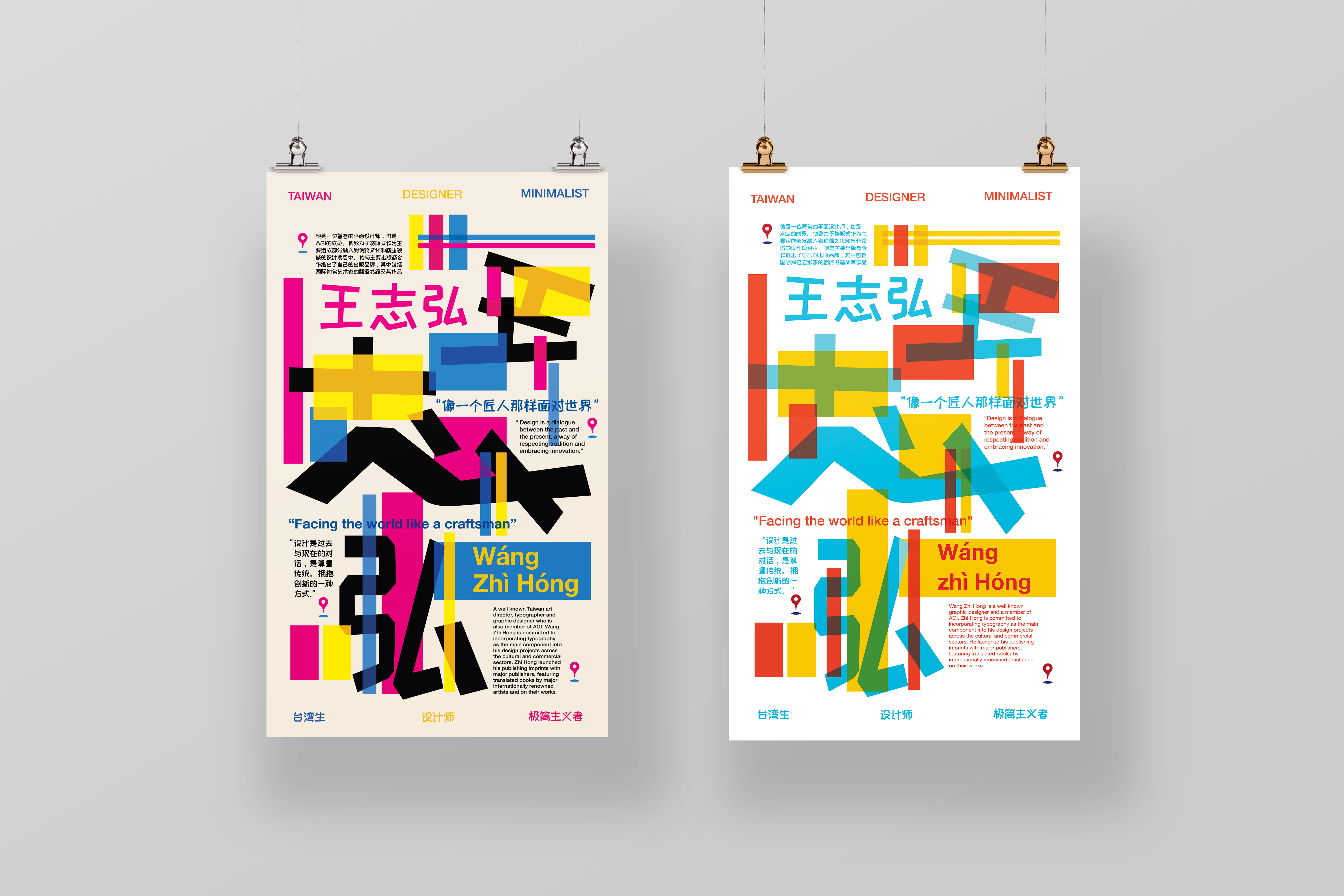
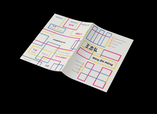
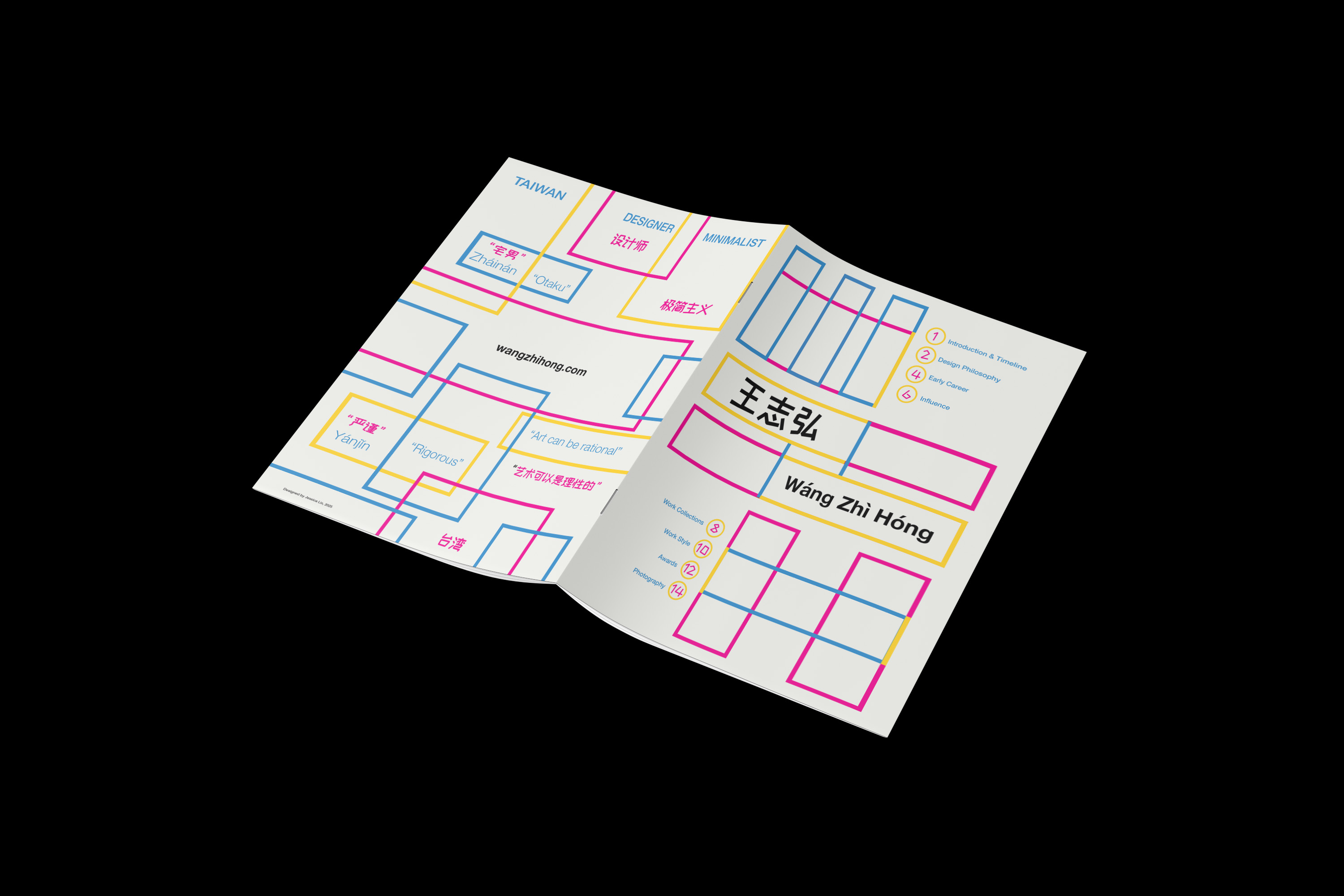
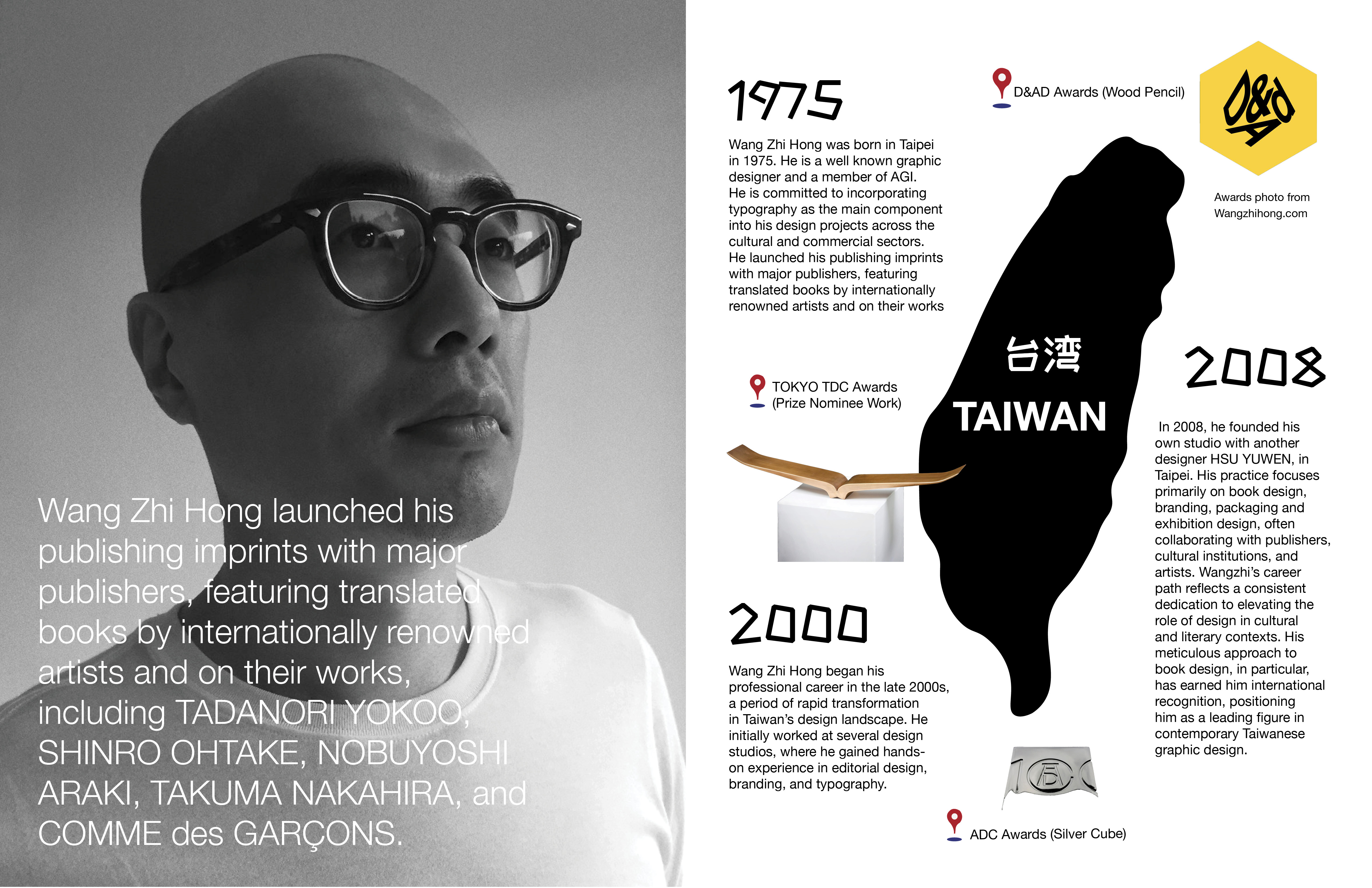
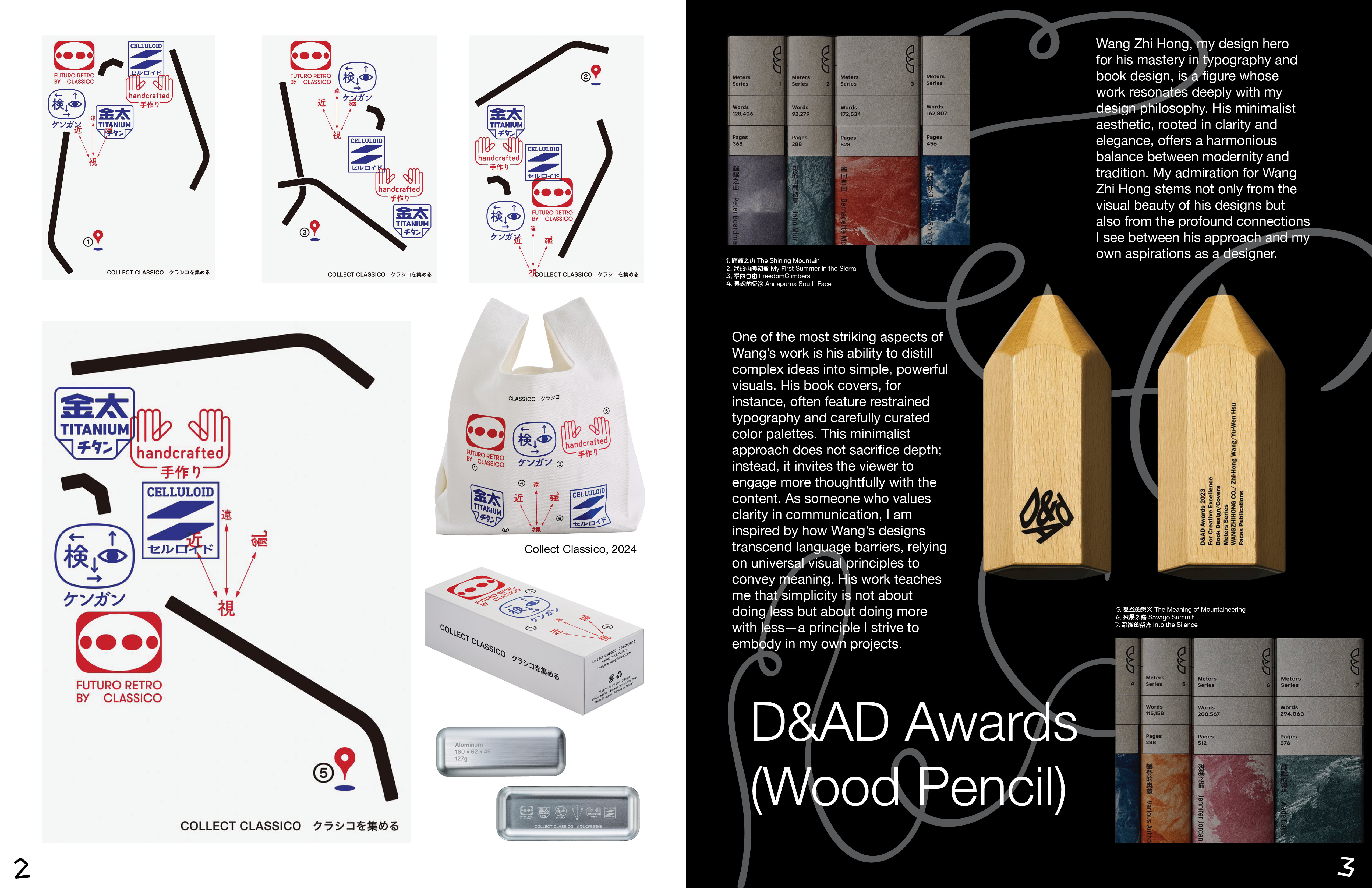
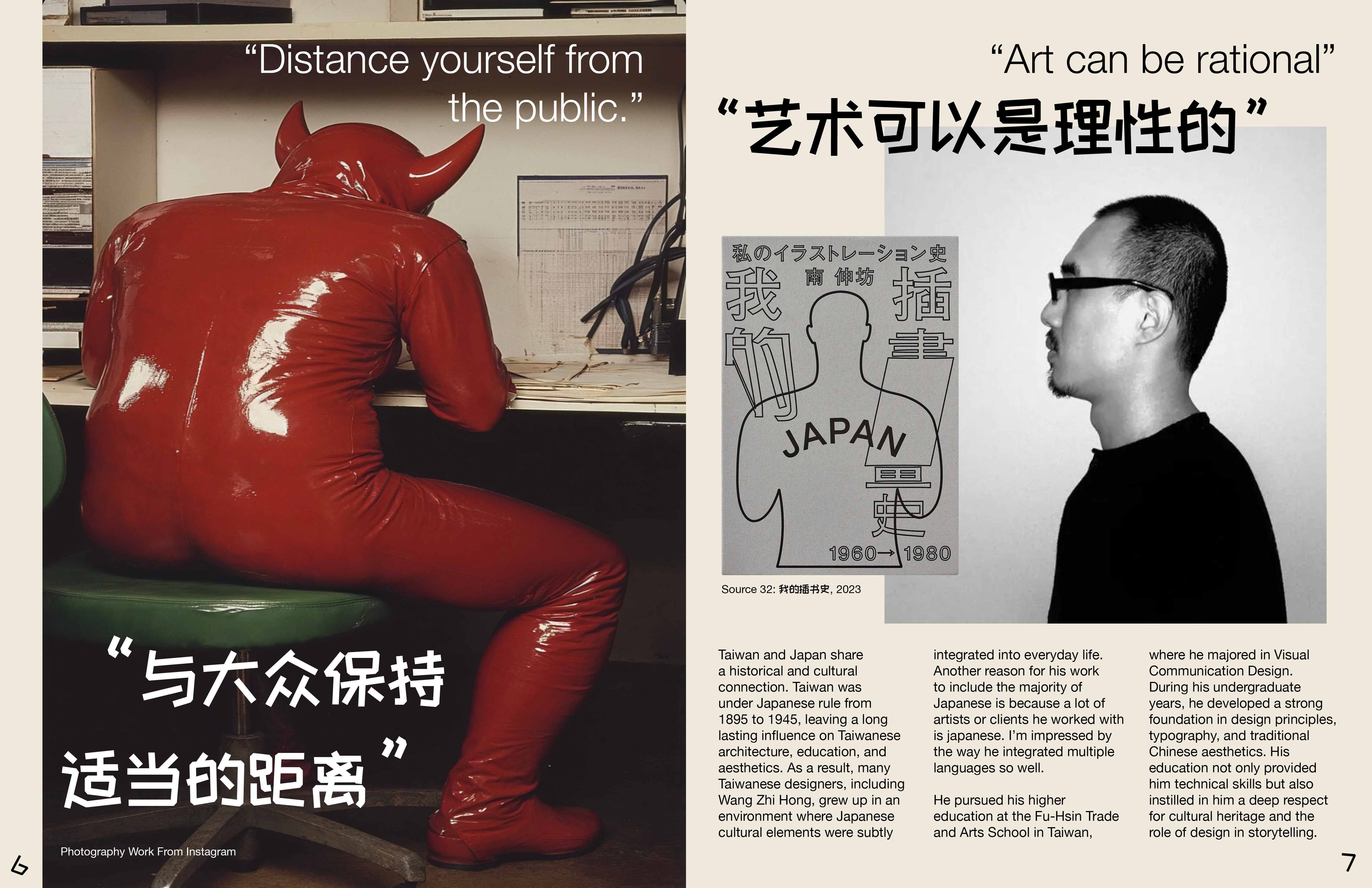
Who is Wang Zhihong?

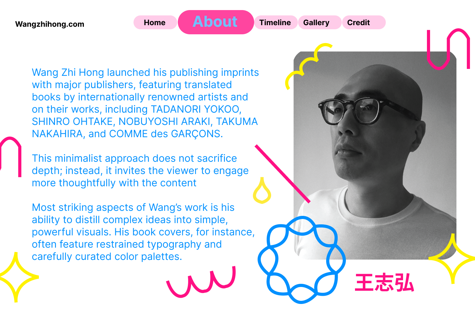
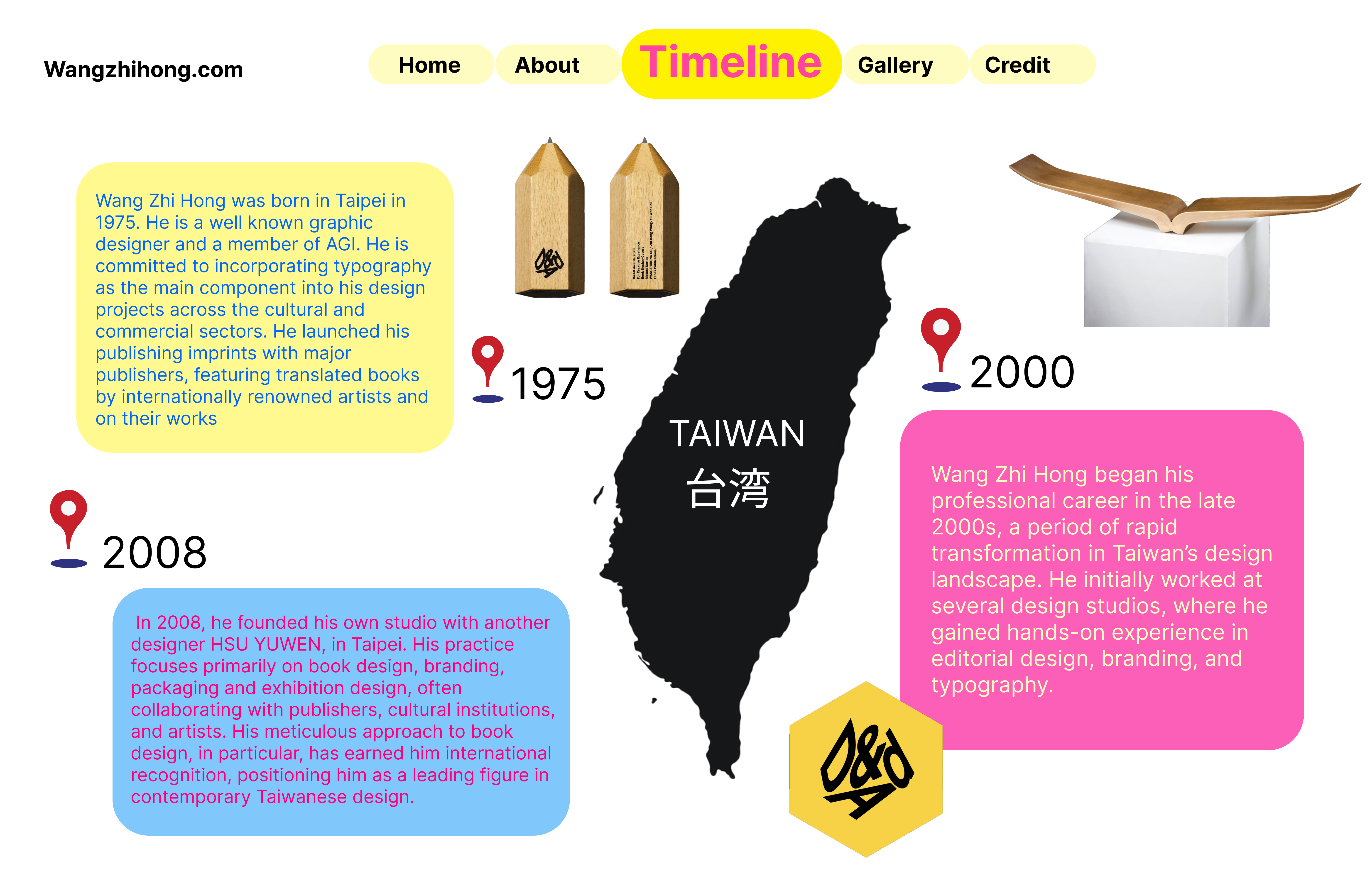
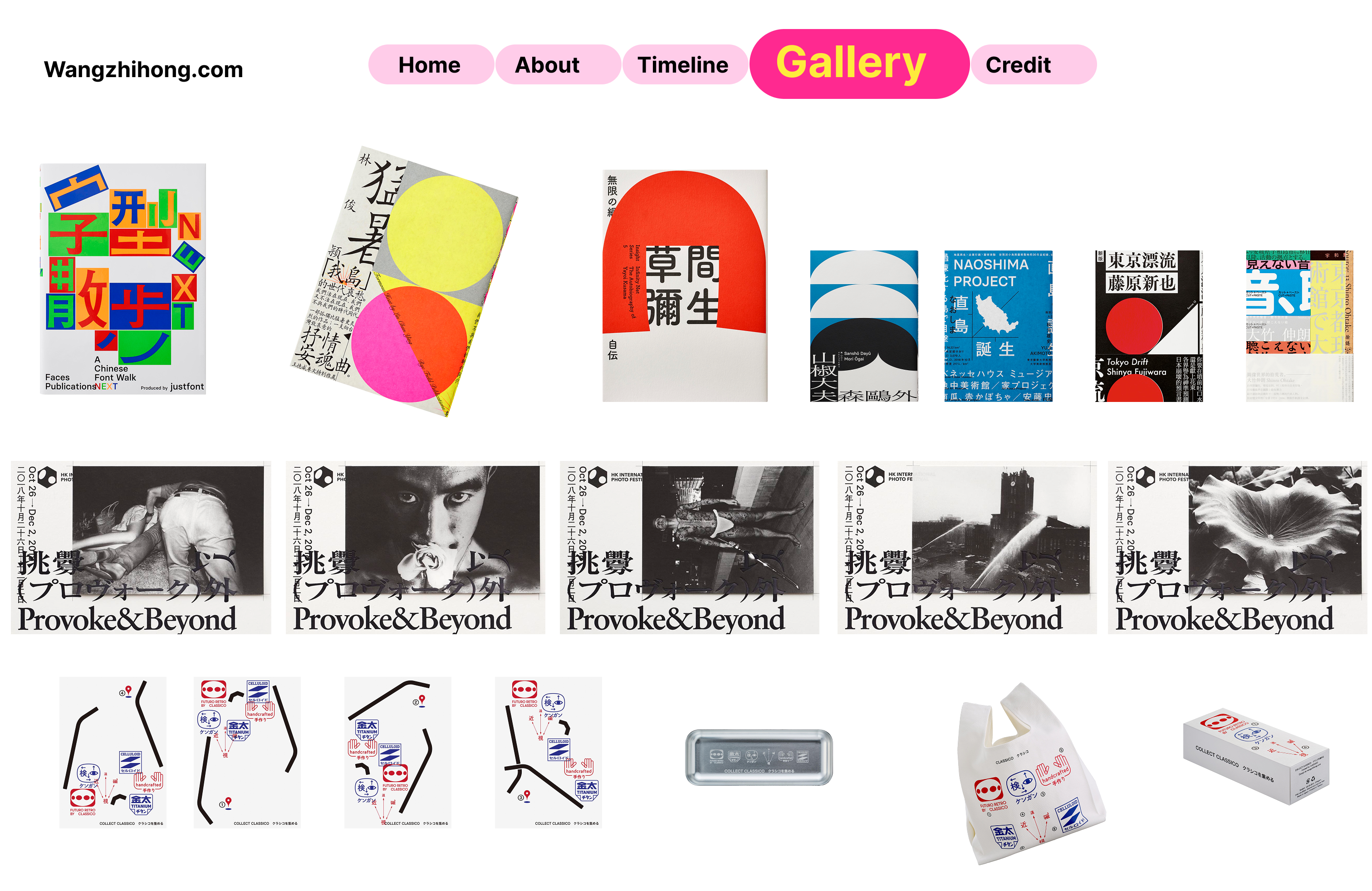
WANG ZHIHONG was born in Taipei in 1975. He is a well known graphic designer and a member of AGI. He is committed to incorporating typography as the main component into his design projects across the cultural and commercial sectors. He launched his publishing imprints with major publishers, featuring translated books by internationally renowned artists and on their works, including TADANORI YOKOO, SHINRO OHTAKE, NOBUYOSHI ARAKI, TAKUMA NAKAHIRA, and COMME des GARÇONS. Among his recognitions are D&AD Awards (Wood Pencil), ADC Awards (Silver Cube), TDC Awards, TOKYO TDC Awards (Prize Nominee Work), and many other awards. He is also the author of DESIGN BY WANGZHIHONG.COM: A SELECTION OF BOOK DESIGNS, 2001–2016. ︎Most well known for his “Source” and “Insight” series, combined together to form the name Source Of Insight.
Outcome 1

Poster

One of the most striking aspects of Wang’s work is his ability to distill complex ideas into simple, powerful visuals. His book covers, for instance, often feature restrained typography and carefully curated color palettes. This minimalist approach does not sacrifice depth; instead, it invites the viewer to engage more thoughtfully with the content. As someone who values clarity in communication, I am inspired by how Wang’s designs transcend language barriers, relying on universal visual principles to convey meaning. His work teaches me that simplicity is not about doing less but about doing more with less — a principle I strive to embody in my own projects.
Outcome 2

Booklet

Through this booklet, I want to tell the story of how Wang Zhi-Hong’s work exists at the intersection of two worlds, merging the precision of Western design methodologies with the poetic subtlety of Chinese typography. The book follows a structured, grid-based composition, mirroring his own design approach while inviting the reader to see typography as a space for dialogue rather than division. Each spread gradually unfolds the layers of his thought process, revealing how a rational grid can still allow for fluid, humanistic expression. In the end, this project is not just about Wang Zhi-Hong’s work but about the broader potential of design — where simplicity and structure serve as a common language between cultures.
Outcome 3

Motion Video

Type remained the central focus of the piece, so I chose to keep the backgrounds minimal and clean, allowing the text and motion to take center stage. I also carefully selected typefaces and weights that reflected my hero’s spirit — balancing playful movements with readable, elegant typography. For part of the type-based video about my design hero, Wang Zhi-Hong, I chose to include a few of his personal quotes. Since the original quotes were in Chinese, I translated them into English, carefully trying to preserve both the meaning and the emotional tone. I wanted the animations not just to “show the words,” but to perform them visually — to bring out the deeper feeling behind each statement through motion, pacing, and visual design.