Font Factoria
By Mattox Shuler
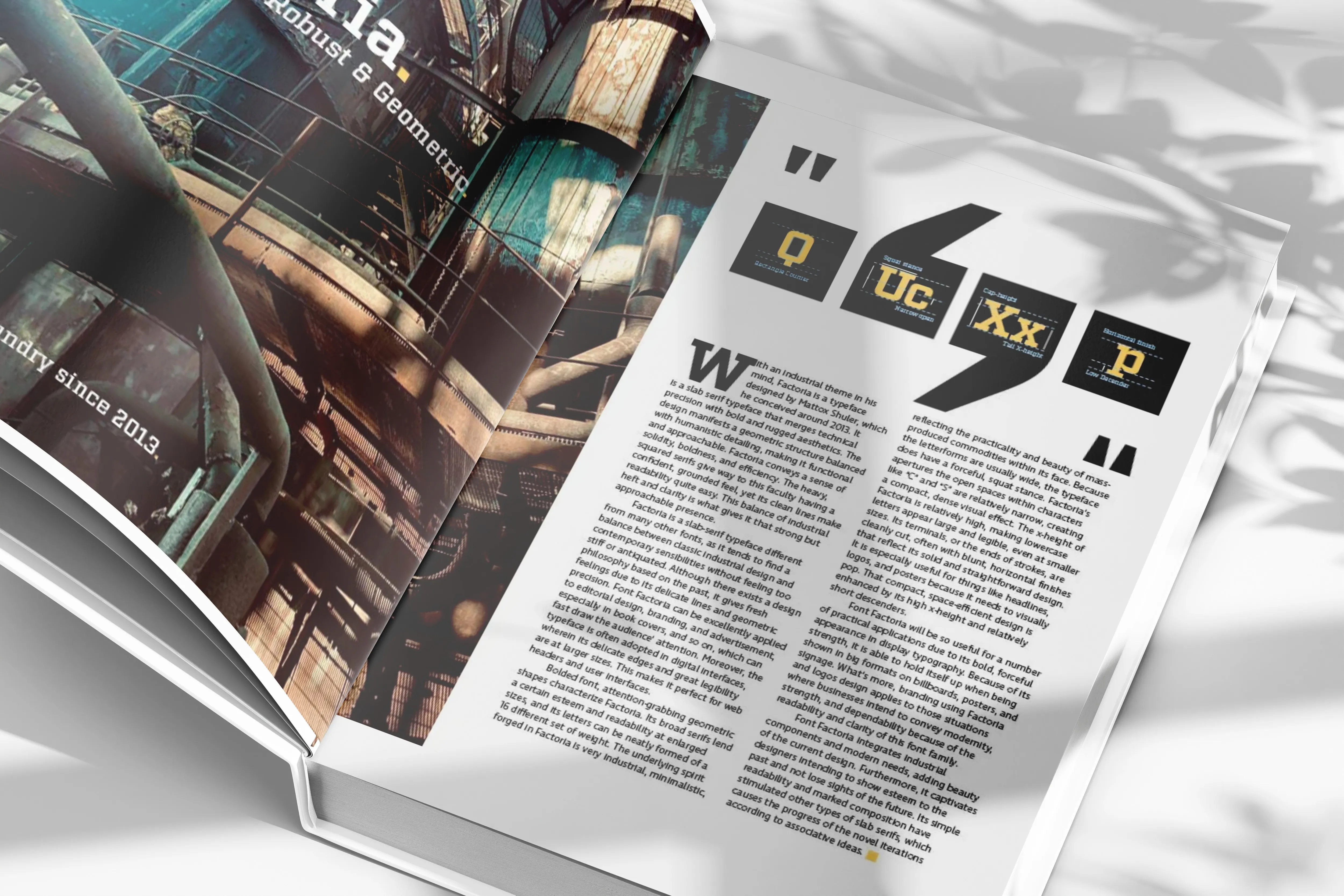
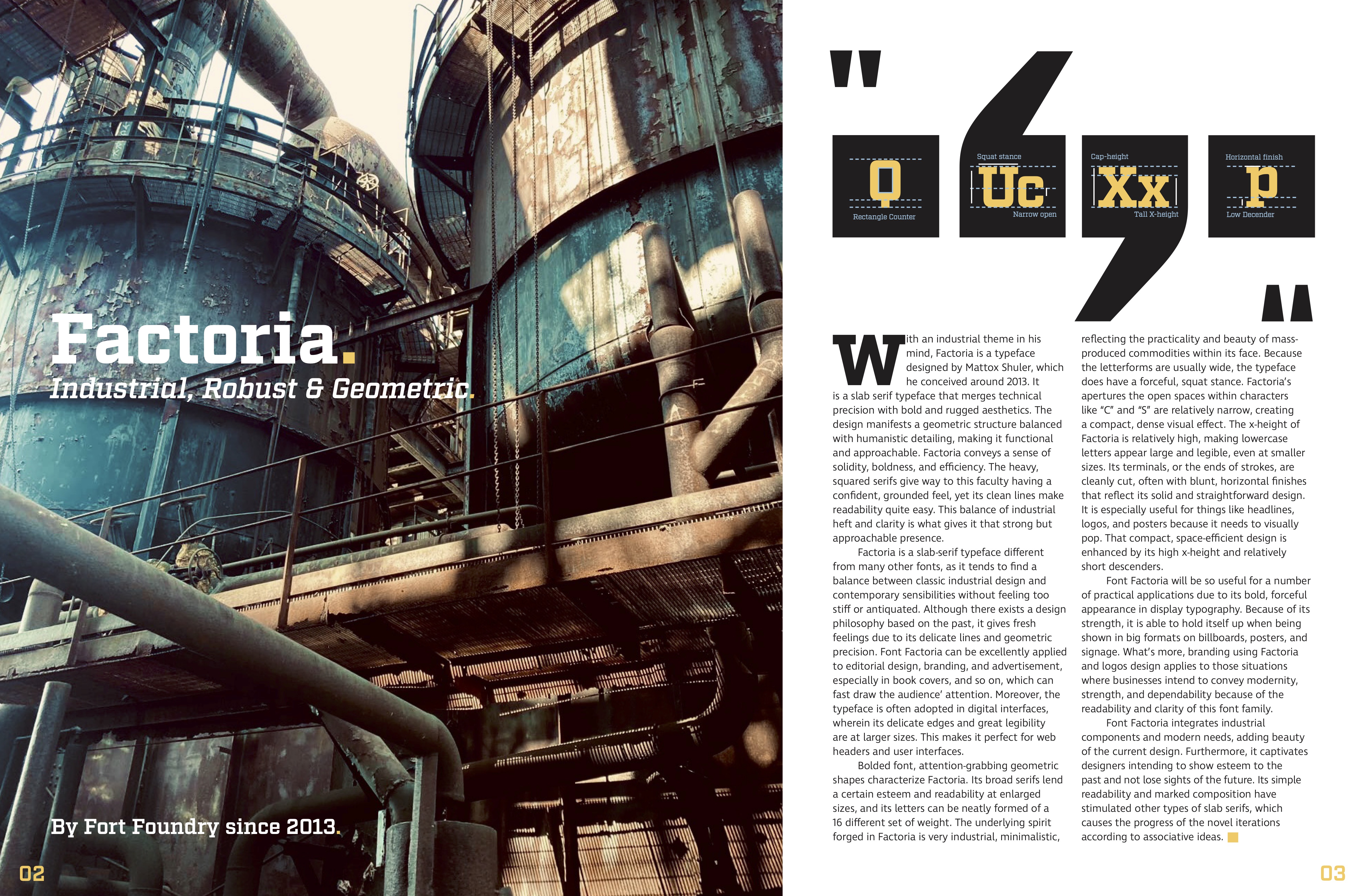
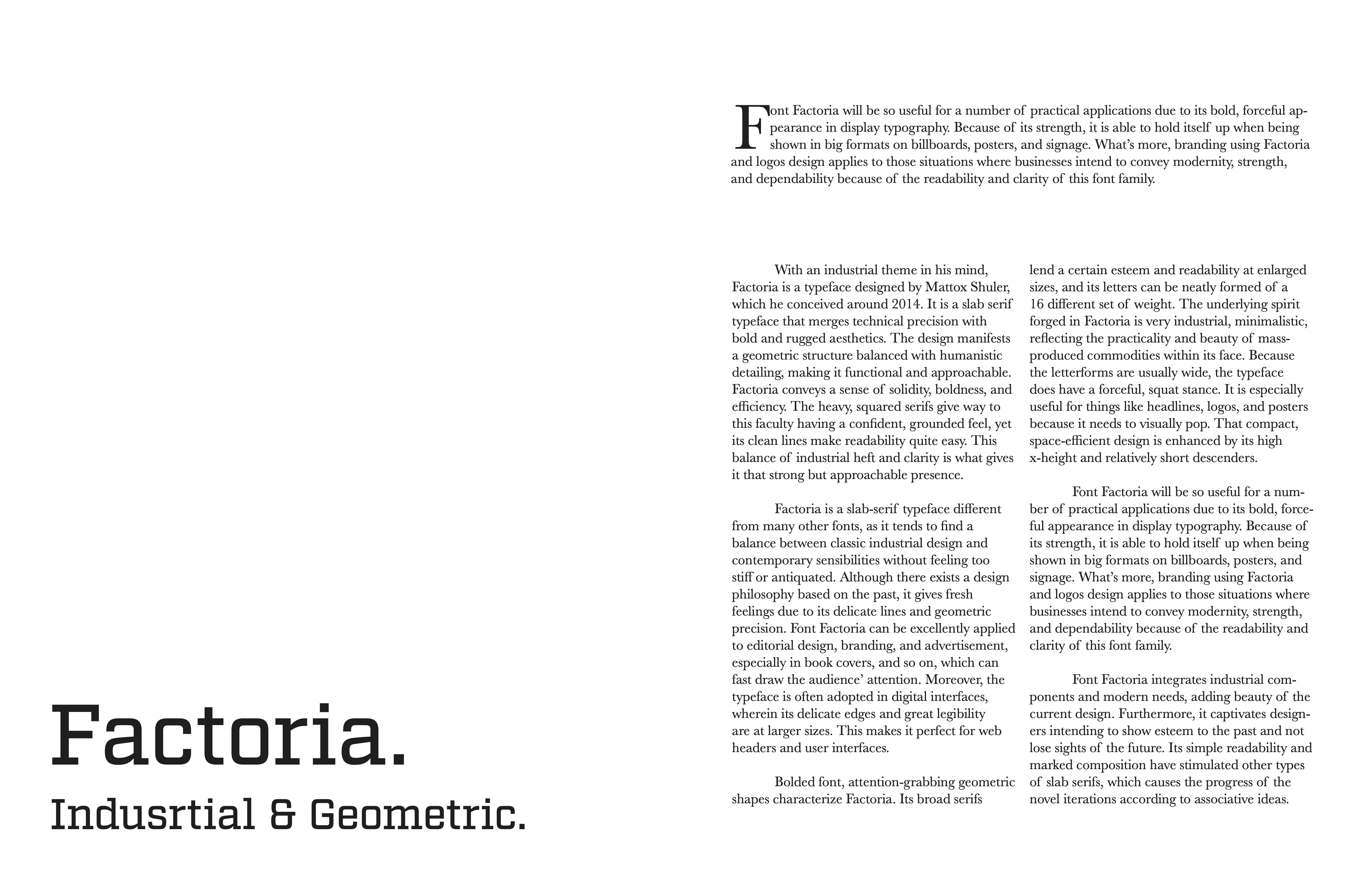
Factoria is a typeface designed by and released by the Process Type Foundry in 2013. It’s a slab serif font family, which means it features thick, block-like serifs. Factoria is often recognized for its strong geometric structure, making it ideal for both display and text purposes. Mattox Shuler, the designer behind Factoria, is an American type designer and co-founder of the Fort Foundry with Brian Brubaker. He is known for creating clean, modern typefaces that combine functional clarity with strong design elements. Factoria was developed to complement another of Olson’s typefaces, Klavika, a slab-serif design. Both fonts share a geometric approach, though Factoria distinguishes itself with its sturdy serifs.


